TCGA Cancer-type-specific TRs
We credit to the data author:
Corces, M. R. et al. The chromatin accessibility landscape of primary human cancers. Science 362 (2018). 10.1126/science.aav1898
The original data was stored in a .xlsx format, which was first separated and converted to .bed format. The converted data can be retrieved from Zenodo.
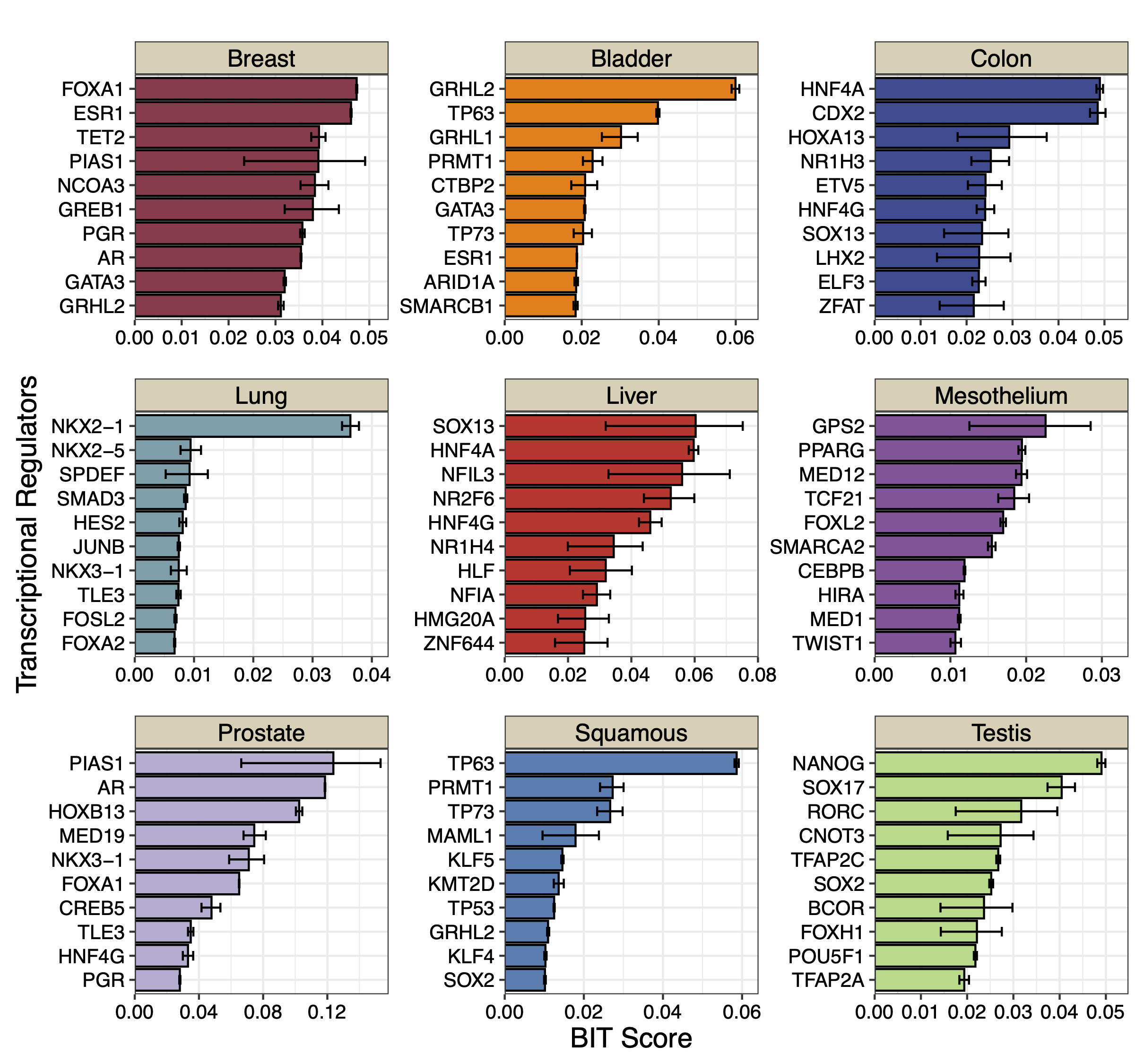
We apply BIT to each dataset, and plot the top 10 TRs along with their 95% credible intervals.
work_dir<-"./Cancer/Data/"
work_files<-list.files(work_dir)
output_dir<-"./Cancer/bit"

dir.create(output_dir, showWarnings = FALSE, recursive = TRUE)

for(i in seq_along(work_files)){
  BIT(paste0(work_dir,work_files[i]),output_dir,plot_bar=FALSE,genome="hg38")
}
DATA_DIR<-"./Cancer/bit"

cancer_files<-list.files(DATA_DIR)
cancer_files<-cancer_files[c(2,1,3,5,4,6,7,8,9)]
cancer_names<-sapply(strsplit(cancer_files,".",fixed=TRUE),function(x){return(x[[1]])})

for(i in 1:9){
  table<-read.csv(paste0(DATA_DIR,cancer_files[i]))
  data<-data.frame(TR=table$TR[1:10],
                   Score=table$BIT_score[1:10],
                   Lower=table$BIT_score_lower[1:10],
                   Upper=table$BIT_score_upper[1:10],
                   group=cancer_names[i])
  data$TR<-factor(data$TR,levels=rev(data$TR))
  plot_list[[i]]<-ggplot(data, aes(x = TR, y = Score)) +
    geom_bar(stat = "identity", fill = colors[i], color = "black") +
    geom_errorbar(aes(ymin = Lower, ymax = Upper), width = 0.4) +
    coord_flip() +
    theme_bw() + scale_y_continuous(limits = c(0, max(data$Upper)+0.005),expand = c(0,0)) + facet_grid(.~group)+
    labs(
      title = "",
      x = "Transcriptional Regulators",
      y = "BIT Score"
    )+theme(title=element_text(size=9),plot.margin=unit(c(0,0.1,0,0.1),"cm"),axis.text.y = element_text(size=10,color="black"),
            axis.text.x = element_text(size=10,color="black"),
            axis.title.x = element_text(size=14,color="black"),
            axis.title.y = element_text(size=14,color="black"),
            strip.background = element_rect(fill="#DBD1B6"),
            strip.text = element_text(size=12, colour="black",margin=ggplot2::margin(1,1,1,1,"mm")))
}

p_combined<-plot_list[[1]]+plot_list[[2]]+ plot_list[[3]] +
  plot_list[[4]]+plot_list[[5]]+plot_list[[6]] +
  plot_list[[7]]+plot_list[[8]]+plot_list[[9]]+ plot_layout(ncol=3,guides="collect",axis_titles = "collect")
print(p_combined)
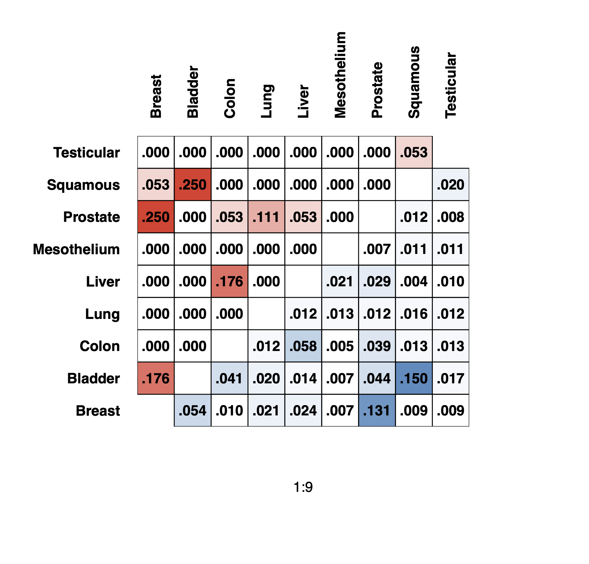
We can generate the jaccard similarity table as shown in Figure. 3C
library(BIT)
work_dir<-"./Cancer/Data/"
work_dir_bit_results<-"./Cancer/bit/"
work_files<-list.files(work_dir)
work_files_bit_results<-list.files(work_dir_bit_results)
work_files_bit_results

#reorder the cancer-types
work_files<-work_files[c(2,1,3,5,4,6,7,8,9)]
cancer_names<-cancer_names[c(2,1,3,5,4,6,7,8,9)]
work_files_bit_results<-work_files_bit_results[c(2,1,3,5,4,6,7,8,9)]

#Define jaccard function
jaccard<-function(v1,v2){
  return(length(intersect(v1,v2))/length(union(v1,v2)))
}

#initialize jaccard table
jac_table<-matrix(nrow=9,ncol=9)
rownames(jac_table)<-cancer_names
colnames(jac_table)<-cancer_names

#for upper-triangle fill by Jaccard of top 10 TRs BIT identified in each cancer type.
#for bottom-triangle fill by Jaccard of binarized cancer-type-specific accessible regions.

for(i in 1:9){
  for(j in 1:9){
    v1<-import_input_regions(paste0(work_dir,work_files[i]),bin_width = 1000, genome = "hg38")
    v2<-import_input_regions(paste0(work_dir,work_files[j]),bin_width = 1000, genome = "hg38")

    table1<-read.csv(paste0(work_dir_bit_results,work_files_bit_results[i]))
    table2<-read.csv(paste0(work_dir_bit_results,work_files_bit_results[j]))

    if(i>j){
      jac_table[i,j]<-jaccard(v1,v2)
    }else if(i<j){
      jac_table[i,j]<-jaccard(table1$TR[1:10],table2$TR[1:10])
    }
  }
}

jac_table
Breast |
Bladder |
Colon |
Lung |
Liver |
Mesothelium |
Prostate |
Squamous |
Testicular |
|
|---|---|---|---|---|---|---|---|---|---|
Breast |
NA |
0.176470588235294 |
0 |
0 |
0 |
0 |
0.25 |
0.0526315789473684 |
0 |
Bladder |
0.0537453812562983 |
NA |
0 |
0 |
0 |
0 |
0 |
0.25 |
0 |
Colon |
0.00960080848913593 |
0.0410479294941446 |
NA |
0 |
0.176470588235294 |
0 |
0.0526315789473684 |
0 |
0 |
Lung |
0.0207134637514384 |
0.020222793487575 |
0.0118102219507229 |
NA |
0 |
0 |
0.111111111111111 |
0 |
0 |
Liver |
0.0242196651278164 |
0.0141432282479715 |
0.0576306357291077 |
0.0116044997039668 |
NA |
0 |
0.0526315789473684 |
0 |
0 |
Mesothelium |
0.00677551927135399 |
0.0069406025247699 |
0.004833120554441 |
0.0125595495885665 |
0.0214275213172596 |
NA |
0 |
0 |
0 |
Prostate |
0.131370509640771 |
0.0441176470588235 |
0.0385856239514776 |
0.0118838396518537 |
0.028598536188669 |
0.00707213578500707 |
NA |
0 |
0 |
Squamous |
0.00891668114179839 |
0.149880952380952 |
0.0131060354242842 |
0.015702416342709 |
0.00359379052276685 |
0.0113628942728401 |
0.01171875 |
NA |
0.0526315789473684 |
Testicular |
0.00936167136557507 |
0.0174708250870129 |
0.0130147012028257 |
0.0119351002378525 |
0.0102943152802043 |
0.0113640786145164 |
0.0076112412177986 |
0.0204625257295072 |
NA |
We use the following code to generate the heatmap plot:
create_mask <- function(mat, direction = c("upper", "lower")) {
  direction <- match.arg(direction)
  n <- ncol(mat)
  dummy <- matrix(NA, n, n)  # Create an n x n matrix for dimensions
  mask <- if (direction == "upper") {
    upper.tri(dummy)
  } else {
    lower.tri(dummy)
  }
  mask[!mask] <- NA
  mask
}

# Generate a heatmap matrix by masking the table based on the specified triangle
plot_heatmap <- function(tbl, direction = "upper") {
  as.matrix(tbl) * create_mask(tbl, direction)
}

# Draw rectangles with overlaid formatted text for cells in the specified triangle
draw_rect <- function(n, table, direction = c("upper", "lower")) {
  direction <- match.arg(direction)
  condition <- if (direction == "upper") {
    function(i, j) j > i
  } else {
    function(i, j) j < i
  }
  for (i in 1:n) {
    for (j in 1:n) {
      if (condition(i, j)) {
        rect(i - 0.5, j - 0.5, i + 0.5, j + 0.5, lwd = 1)
        formatted <- sprintf("%.3f", table[i, j])
        number <- sub("^0+", "", formatted)
        text(i, j, number, col = "black", cex = 1, font = 2)
      }
    }
  }
}

# Plotting parameters and drawing the heatmaps with overlayed annotations
collab <- "black"
par(mfrow = c(1, 1), oma = c(2, 2, 2, 2), mar = c(6, 6, 6, 5))

# Plot the upper triangle heatmap
image(1:9, 1:9, plot_heatmap(jac_table, "upper"), ylab = "", axes = FALSE,
      col = colorRampPalette(c("#FFFFFF", "#EE4431"))(20))

# Overlay the lower triangle heatmap
image(1:9, 1:9, plot_heatmap(jac_table, "lower"), ylab = "", axes = FALSE, add = TRUE,
      col = colorRampPalette(c("#FFFFFF", "#4C8BC0"))(20))

# Draw rectangles and add text for both triangles
draw_rect(9, jac_table, "upper")
draw_rect(9, jac_table, "lower")

# Add axis labels
axis(3, at = 1:9, labels = colnames(jac_table)[1:9], las = 2, lty = 0, tck = 0,
     cex.axis = 1, tcl = -0.2, font.axis = 2, col.axis = collab)
axis(2, at = 1:9, labels = colnames(jac_table)[1:9], las = 1, lty = 0, tck = 0,
     cex.axis = 1, tcl = -0.2, font.axis = 2, col.axis = collab)
To contrast with the DepMap CRISPR/cas9 TR knock-out screen data, we need extra datasets CRISPRGeneEffect.csv and Model.csv, which are now available on updated Zenodo data, in the folder of /DepMap/.
crispr_gene_effect<-as.data.frame(fread("./DepMap/CRISPRGeneEffect.csv"))
colnames(crispr_gene_effect)<-sapply(strsplit(colnames(crispr_gene_effect)," ",fixed=TRUE),function(x){return(x[[1]])})
Model<-read.csv("./DepMap/CRISPR/Model.csv")

#Filter out the cell lines belong to specific cancer type
cluster_code<-list("Breast"=c("BRCA"),
                   "Bladder"=c("BLCA"),
                   "Colon"=c("COAD"),
                   "Liver"=c("HCC"),
                   "Lung"=c("LUAD"),
                   "Mesothelium"=c("PLBMESO","PLEMESO","PLMESO"),
                   "Prostate"=c("PRAD"),
                   "Squamous"=c("HNSC","LUSC","ESCA","CESC"),
                   "Testis"=c("EMBCA","TT")
)

model_ids_func<-function(x){
  model_ids<-c()
  for(i in seq_along(x)){
    model_ids<-c(model_ids,Model$ModelID[which(Model$OncotreeCode==x[i])])
  }
  return(model_ids)
}

Model_ids<-lapply(cluster_code, model_ids_func)
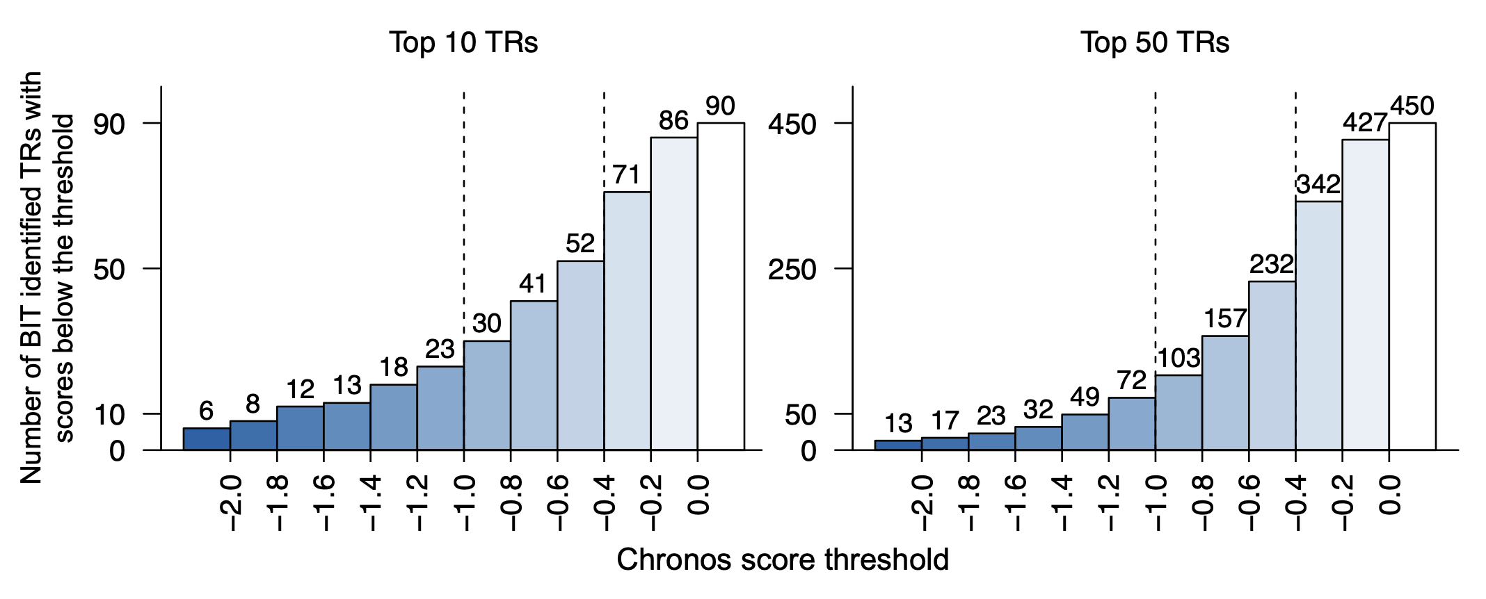
Once we have the CRISPR/cas9 data, we can first replicate the Figure. 4D to show the total number of TRs ranked to top 10 / top 50 by putting a thrshold on Chronos score.
stepss<-seq(-2,0,0.2)
length(stepss)
start_color<-"#1663A9"
end_color<-"#FFFFFF"
color_palette <- colorRampPalette(c(start_color, end_color))
colors<-color_palette(length(stepss)+1)

mini_scores<-c()
method_tf<-bit_table

TR_TOP_10_thres_TABLE<-data.frame(matrix(ncol=9,nrow=11))
TR_TOP_50_thres_TABLE<-data.frame(matrix(ncol=9,nrow=11))

for(i in 1:9){
  model_ids<-Model_ids[[i]]
  cancer_name<-names(cluster_code)[i]
  subtable_10<-crispr_gene_effect[which(crispr_gene_effect$ModelID%in%model_ids),method_tf[which(method_tf[1:10,cancer_name]%in%colnames(crispr_gene_effect)),cancer_name]]
  subtable_50<-crispr_gene_effect[which(crispr_gene_effect$ModelID%in%model_ids),method_tf[which(method_tf[1:50,cancer_name]%in%colnames(crispr_gene_effect)),cancer_name]]
  vec_min_10<-c()
  for(k in 1:ncol(subtable_10)){
    vec_min_10<-c(c(vec_min_10,min(subtable_10[,k])))
  }
  vec_min_50<-c()
  for(k in 1:ncol(subtable_50)){
    vec_min_50<-c(c(vec_min_50,min(subtable_50[,k])))
  }
  for(j in 1:length(stepss)){
    TR_TOP_10_thres_TABLE[j,i]<-sum(vec_min_10<=(stepss[j]),na.rm=TRUE)
    TR_TOP_50_thres_TABLE[j,i]<-sum(vec_min_50<=(stepss[j]),na.rm=TRUE)
  }
}

#10
cumsums<-rowSums(TR_TOP_10_thres_TABLE)
cumsums<-c(cumsums,90)
cumsums
bp1<-barplot(cumsums,space=0,col=colors,axes=FALSE,ylim=c(0,100),xaxt="n")
box(bty="l")
text(bp1,cumsums+5,cumsums,cex=0.9,font=1)
tick_positions<-bp+0.5
axis(1,at=tick_positions[1:11],format(stepss,nsmall=1),las=3,cex=1.3)
axis(2,at=c(0,10,50,90),c(0,10,50,90),las=2,cex.axis=1)
abline(v=6,xpd=FALSE,lty=2)
abline(v=9,xpd=FALSE,lty=2)
title(main="Top 10 TRs",cex.main=1,font.main=1,line=1)

#50
cumsums<-c(rowSums(TR_TOP_50_thres_TABLE),450)
bp2<-barplot(cumsums,space=0,col=colors,axes=FALSE,ylim=c(0,500),bty="l")
text(bp2,cumsums+25,cumsums,cex=0.9,font=1)
box(bty="l")
tick_positions<-bp+0.5
axis(1,at=tick_positions[1:11],format(stepss,nsmall=1),las=3,cex=1.3)
axis(2,at=c(0,50,250,450),c(0,50,250,450),las=2,cex=1.3)
abline(v=6,xpd=FALSE,lty=2)
abline(v=9,xpd=FALSE,lty=2)
title(main="Top 50 TRs",cex.main=1,font.main=1,line=1)
title(xlab = "Chronos score threshold",ylab="Number of BIT identified TRs with\nscores below the threshold",outer = TRUE,line=1)
Next, we apply state-of-the-art methods to analyze the generated *.bed files and extract outputs from each method. The following tools are used:
We merged the outputs from each cancer-type to get the merged output table for each method.
#################Cancer
work_dir_cancer<-"./Cancer"

bart2_table<-read.csv(paste0(work_dir,"bart2_table.csv"))
chip_atlas_table<-read.csv(paste0(work_dir,"chip_atlas_table.csv"))
bit_table<-read.csv(paste0(work_dir,"bit_table.csv"))
icistarget_table<-read.csv(paste0(work_dir,"icistarget_table.csv"))
whichtf_files<-read.csv(paste0(work_dir,"whichtf_table.csv"))
homer_table<-read.csv(paste0(work_dir,"homer_table.csv"))

table_lists<-list("BIT"=bit_table,
                  "BART2"=bart2_table,
                  "ChIP-Atlas"=chip_atlas_table,
                  "HOMER"=homer_table,
                  "i-cisTarget"=icistarget_table,
                  "WhichTF"=whichtf_table)
We next contrat the results of BIT with the results from other state-of-the-art methods based on Chronos score threshold \(-0.4\):
TR_TOP_10_TABLE<-data.frame(matrix(ncol=9,nrow=6))
TR_TOP_50_TABLE<-data.frame(matrix(ncol=9,nrow=6))
rownames(TR_TOP_10_TABLE)<-names(table_lists)
rownames(TR_TOP_50_TABLE)<-names(table_lists)
colnames(TR_TOP_10_TABLE)<-names(cluster_code)
colnames(TR_TOP_50_TABLE)<-names(cluster_code)
for(i in 1:9){
model_ids<-Model_ids[[i]]
cancer_name<-names(cluster_code)[i]
for(j in 1:6){
method_tf<-table_lists[[j]]
subtable_10<-crispr_gene_effect[which(crispr_gene_effect$ModelID%in%model_ids),method_tf[which(method_tf[1:10,cancer_name]%in%colnames(crispr_gene_effect)),cancer_name]]
subtable_50<-crispr_gene_effect[which(crispr_gene_effect$ModelID%in%model_ids),method_tf[which(method_tf[1:50,cancer_name]%in%colnames(crispr_gene_effect)),cancer_name]]
vec_min_10<-c()
for(k in 1:ncol(subtable_10)){
vec_min_10<-c(c(vec_min_10,min(subtable_10[,k])))
}
vec_min_50<-c()
for(k in 1:ncol(subtable_50)){
vec_min_50<-c(c(vec_min_50,min(subtable_50[,k])))
}
TR_TOP_10_TABLE[j,i]<-sum(vec_min_10<=(-0.4),na.rm=TRUE)
TR_TOP_50_TABLE[j,i]<-sum(vec_min_50<=(-0.4),na.rm=TRUE)
}
}
rowSums(TR_TOP_10_TABLE)
rowSums(TR_TOP_50_TABLE)
TR_TOP_50_TABLE
TR_TOP_10_TABLE
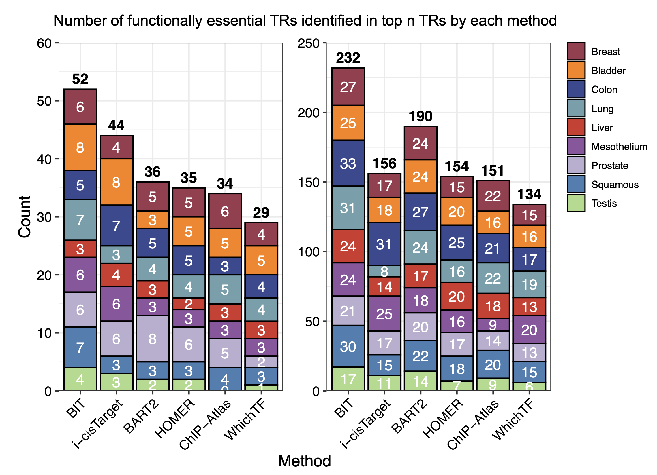
#> TR_TOP_50_TABLE
# Breast Bladder Colon Liver Lung Mesothelium Prostate Squamous Testis Method
#BIT 27 25 33 24 31 24 21 30 17 BIT
#BART2 24 24 27 17 24 18 20 22 14 BART2
#ChIP-Atlas 22 16 21 18 22 9 14 20 9 ChIP-Atlas
#HOMER 15 20 25 20 16 16 17 18 7 HOMER
#i-cisTarget 17 18 31 14 8 25 17 15 11 i-cisTarget
#WhichTF 15 16 17 13 19 20 13 15 6 WhichTF
#> TR_TOP_10_TABLE
# Breast Bladder Colon Liver Lung Mesothelium Prostate Squamous Testis Method
#BIT 6 8 5 3 7 6 6 7 4 BIT
#BART2 5 3 5 3 4 3 8 3 2 BART2
#ChIP-Atlas 6 5 3 3 5 3 5 4 0 ChIP-Atlas
#HOMER 5 5 5 2 4 3 6 3 2 HOMER
#i-cisTarget 4 8 7 4 3 6 6 3 3 i-cisTarget
#WhichTF 4 5 4 3 4 3 2 3 1 WhichTF
Next we plot the stacked barplot to show the total number of functionally essential TRs identified by each method:
TR_TOP_10_TABLE$Method<-rownames(TR_TOP_10_TABLE)
df_long <- pivot_longer(TR_TOP_10_TABLE,
                        cols = -Method,    # all columns except 'method'
                        names_to = "cancer",
                        values_to = "count")

colors<-c("#9B3A4D","#FC8002","#394A92","#70A0AC","#D2352C","#8E549E","#BAAFD1","#497EB2","#ADDB88")

df_long$Method<-factor(df_long$Method,levels=c("BIT","i-cisTarget","BART2","HOMER","ChIP-Atlas","WhichTF"))
df_long$cancer<-factor(df_long$cancer,levels=c("Breast","Bladder","Colon","Lung","Liver","Mesothelium","Prostate","Squamous","Testis"))
df_totals <- df_long %>%
  group_by(Method) %>%
  summarise(total = sum(count))

p1<-ggplot(df_long, aes(x = Method, y = count, fill = cancer)) +
  # Create the stacked bars with a black outline for each segment
  geom_bar(stat = "identity", color = "black", position = "stack") +
  # Add text labels for the count of each cancer in the stacked segments
  geom_text(aes(label = count),
            position = position_stack(vjust = 0.5),
            color = "white") +
  # Add the total sum above each bar in bold
  geom_text(data = df_totals,
            aes(x = Method, y = total, label = total),
            inherit.aes = FALSE,
            vjust = -0.5,  # Adjust this value as needed for spacing
            fontface = "bold") +
  # Remove extra space from the y-axis (starting at 0)
  scale_y_continuous(expand = c(0, 0),limits=c(0,60)) +
  # Manually assign specific colors for each cancer type.
  scale_fill_manual(values = c("Breast"      = "#9B3A4D",
                               "Bladder"     = "#FC8002",
                               "Colon"       = "#394A92",
                               "Liver"       = "#D2352C",
                               "Lung"        = "#70A0AC",
                               "Mesothelium" = "#8E549E",
                               "Prostate"    = "#BAAFD1",
                               "Squamous"    = "#497EB2",
                               "Testis"      = "#ADDB88")) +
  labs(x = "Method",
       y = "Count",
       title = "") +
  theme_bw()+theme(axis.text.x=element_text(angle=45,color="black",size=10,hjust=1),
                   axis.text.y=element_text(size=10,color="black"),
                   axis.title.x=element_text(size=12,color="black"),
                   axis.title.y=element_text(size=12,color="black"))

TR_TOP_50_TABLE$Method<-rownames(TR_TOP_50_TABLE)

df_long <- pivot_longer(TR_TOP_50_TABLE,
                        cols = -Method,    # all columns except 'method'
                        names_to = "cancer",
                        values_to = "count")

colors<-c("#9B3A4D","#FC8002","#394A92","#70A0AC","#D2352C","#8E549E","#BAAFD1","#497EB2","#ADDB88")

df_long$Method<-factor(df_long$Method,levels=c("BIT","i-cisTarget","BART2","HOMER","ChIP-Atlas","WhichTF"))
df_long$cancer<-factor(df_long$cancer,levels=c("Breast","Bladder","Colon","Lung","Liver","Mesothelium","Prostate","Squamous","Testis"))
df_totals <- df_long %>%
  group_by(Method) %>%
  summarise(total = sum(count))

p2<-ggplot(df_long, aes(x = Method, y = count, fill = cancer)) +
  # Create the stacked bars with a black outline for each segment
  geom_bar(stat = "identity", color = "black", position = "stack") +
  # Add text labels for the count of each cancer in the stacked segments
  geom_text(aes(label = count),
            position = position_stack(vjust = 0.5),
            color = "white") +
  # Add the total sum above each bar in bold
  geom_text(data = df_totals,
            aes(x = Method, y = total, label = total),
            inherit.aes = FALSE,
            vjust = -0.5,  # Adjust this value as needed for spacing
            fontface = "bold") +
  # Remove extra space from the y-axis (starting at 0)
  scale_y_continuous(expand = c(0, 0),limits=c(0,250)) +
  # Manually assign specific colors for each cancer type.
  scale_fill_manual(values = c("Breast"      = "#9B3A4D",
                               "Bladder"     = "#FC8002",
                               "Colon"       = "#394A92",
                               "Liver"       = "#D2352C",
                               "Lung"        = "#70A0AC",
                               "Mesothelium" = "#8E549E",
                               "Prostate"    = "#BAAFD1",
                               "Squamous"    = "#497EB2",
                               "Testis"      = "#ADDB88")) +
  labs(x = "Method",
       y = "Count",
       title = "") +
  theme_bw()+theme(axis.text.x=element_text(angle=45,color="black",size=10,hjust=1),
                   axis.text.y=element_text(size=10,color="black"),
                   axis.title.x=element_text(size=12,color="black"),
                   axis.title.y=element_text(size=12,color="black"))
library(patchwork)

plot_comb<-p1 + p2 + plot_layout(ncol=2,guides="collect",axes="collect")
print(plot_comb)